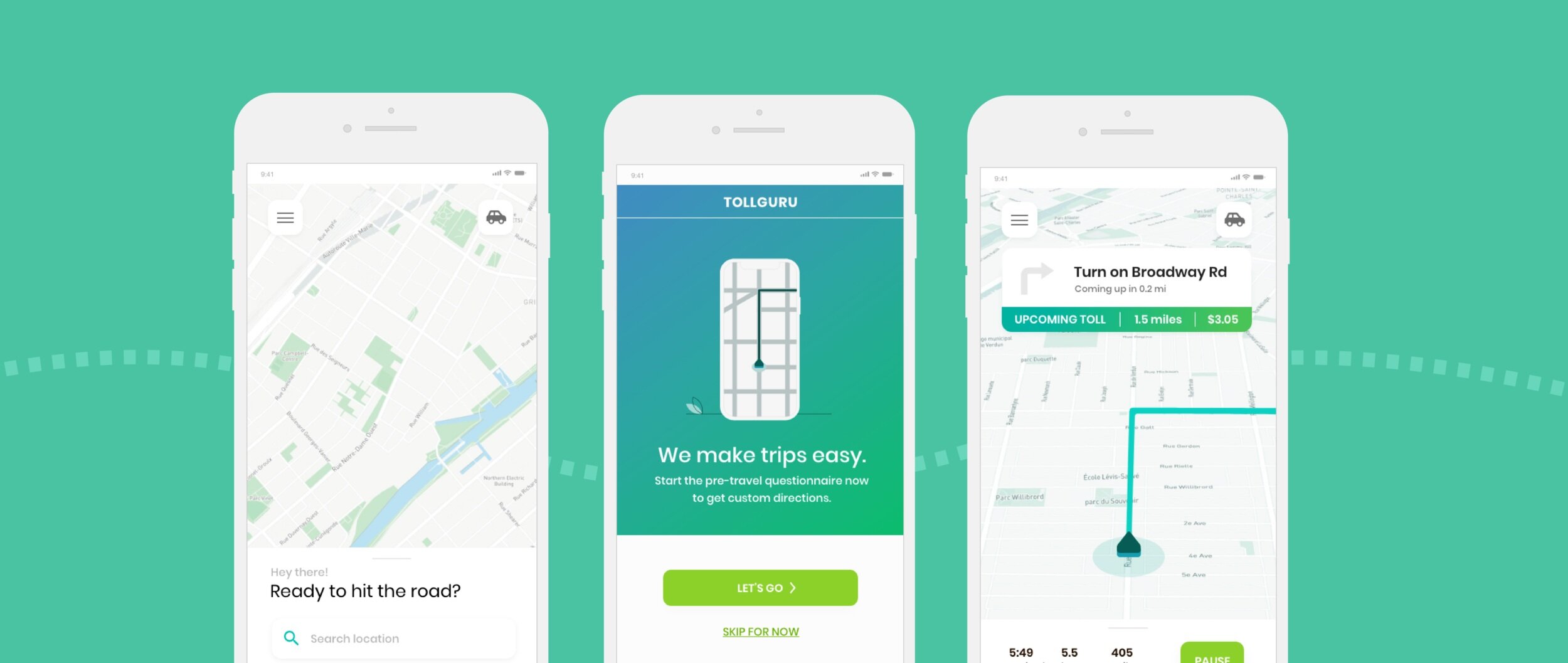
TollGuru Case Study
Problem
The purpose of the app is to simply calculate costs for users, however, this is not the case. The lack of organization and excessive interface elements makes the overall user experience confusing and unproductive.
Scope
Redesign the already existing TollGuru app by identifying the interface pain points and developing user-centered design solutions.
Role
Low fidelity designs
High fidelity designs
User testing

Research
As-Is User Flow
Process started with creating user flows for how the app functioned as-is. This helped highlight where the main pain points lived.
Key takeaways:
Too many options displayed at once.
Information being disorganized and thrown at the user with no clear intention. Unhelpful groupings.
User has no way of going back to the original screen. They must first choose between all of this information.
Multiple actions take users to complete the same task.
Overall UI appeal is bland and lacks contrast.
Personas
Main Personas
Once there was a solid understanding of the as-is app, looking to TollGuru’s users helped to shape the solutions to some of the highlighted issues.
Key takeaways:
Similarities: Both personas need to rent vehicles and have different levels of driving experience.
Differences: Samantha persona is a new driver and is budget conscious, where as Annie is a seasoned driver and is prioritizing efficiency over cost.
Pain points: Samantha gets confused by technical details when it comes to cars and road trips and Annie has road rage and is not tech savy.
Redesign
Revised User Flow + Wireframe Creation
After understanding the user needs, the next steps were to revise the original user flow to specifically hit the main pain points and to start wire-framing.
Goals + Features
The goal over all when re-designing was to: reduce the taxing interaction with the app to a more straightforward experience and add interface/feature enhancements to better fit the needs of the end user. With users being the central focus, user personas were used as guidelines throughout this redesign.
New key experiences:
Reorganize the first part of the user journey. Start with them interacting with a landing page to help orient the user.
Then, transition to pre-travel q&a to get a better understanding of the drivers comfort level and overall needs.
Next, have a walk-me tour once the user enters submits their answers.
Fourthly, have the user enter their vehicle information (automated or manually filled).
Lastly, have the user input their end destination to start their trip.
Gained features:
Actions that allow users to input their: budget, driving experience, and if they own a vehicle.
Provide the option to rent a car through the app.
Include an in app map + directions. Nested in this experience, users will have access to an FAQ section, their pre-travel answers, and general app settings.
Graphics that make the renting a car in-context more intuitive.


